16 Quarto Document Elements
Now, this is all well and good - but let’s work on bringing in some of the key types of layout elements we’ll want to use in our Quarto documents.
16.1 Headers
Within our document, we will want to be able to separate out parts of the document with headers and subheaders.
The headers can also automatically be used to build an interactive table of contents for the document if we tell Quarto that we want a table of contents (or, later, if we’re creating a special kind of Quarto document that makes tables of contents automatically, like an ebook).
Headers are denoted using the # symbol. This is the same symbol we use for comments in our Python or R code, but if it’s just in a Quarto document (and not inside a code block - more on those in the next chapter), then it will be interpreted and rendered as a header.
# This is a level 1 header
## This is a level 2 header
### This is a level 3 header
#### This is a level 4 header
##### This is a level 5 header
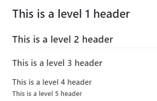
The above will render in your document like this:

Make sure there is a gap between the hash and the word you want to make into a title!
#This won't work
# But this will!
16.2 Text Formatting
Text can be formatted using the * character.
You must wrap the text in a single * for italics, ** for bold, and *** for bold/italic.
*This is italic text*
This is italic text
**This is bold text**
This is bold text
***This is a mix***
This is a mix
You can *use* a mixture **in the** same ***sentence***.
You can use a mixture in the same sentence.
16.3 Links
Simple links can be created like this:
<https://www.youtube.com/@hsma>
If you don’t want the link to display the actual URL and would rather have some nice text, they are created with the following syntax:
[Text to Display](https://your-link-here.com)
For example, you can link to the HSMA website like so:
[Click here to open up the HSMA website](https://www.youtube.com/@hsma)
16.4 Images
Images are created using a similar notation to links.
They are done in the format
![]()
- The ! lets markdown know it’s an image
- Inside the [] you can optionally put a caption.
- Inside the () you place a link to the image relative to the location of the document OR on the web.
16.4.1 Web Image Example

![]()
16.4.2 Local Image Example

This points towards an image where there is a folder called ‘resources’ at the same level as the .qmd file being written. It moves into the resources folder, then looks for an image called cover_image.jpeg.

16.5 Gifs
Gifs are a little different - we embed them in something called an iframe.
We structure these blocks a little differently, starting with three backticks (``````) and {=html}
{=html} <div align="center"> <iframe width="1200" height="700" src="assets/Code_pYlJdxlDDN.gif"></iframe> </div>
16.6 Embedding a webpage
You can also embed entire webpages into your Quarto document.
Keep in mind that some websites don’t like to be embedded and won’t work properly.
Check the preview and the final .html document to confirm that it’s ok!
{=html} <iframe width="1200" height="800" src="https://sites.google.com/nihr.ac.uk/hsma/home" title="HSMA - the little book of DES"></iframe>
16.7 Videos
Videos hosted on sites like youtube or platforms like Google Drive can be embedded like so.
While you can point directly to local .mpeg files, this could cause problems with file size of the resulting document.
16.8 Lists
Lists can be created in a number of ways
- list item 1
- list item 2
    - list sub item
- list item 3- list item 1
- list item 2
- list sub item
- list item 3
* list item 1
* list item 2
    * list sub item
* list item 3- list item 1
- list item
- list sub item
- list item 3
1. list item 1
2. list item 2
    a. list subitem
4. list item 3- list item 1
- list item 2
- list subitem
- list item 3
1. list item 1
1. list item 2
    1. list subitem
1. list item 3- list item 1
- list item 2
- list subitem
- list item 3
Lists will not work if you don’t include a blank line before starting them.
For example,
My shopping list contains
- Now that's what I call 80s - vol 2 CD
- Back To The Future II - Extended Mega Cut VHS
- Return to Monkey Island
will not work, and will display like this:
My shopping list contains - Now that’s what I call 80s - vol 2 CD - Back To The Future II - Extended Mega Cut VHS - Return to Monkey Island
If we instead ensure there is a gap, like so:
My shopping list contains

- Now that's what I call 80s - vol 2 CD
- Back To The Future II - Extended Mega Cut VHS
- Return to Monkey Island
it will display as expected:
My shopping list contains
- Now that’s what I call 80s - vol 2 CD
- Back To The Future II - Extended Mega Cut VHS
- Return to Monkey Island
16.9 Callouts
Callouts allow you to draw attention to different parts of your document.
There are 5 key types:
{.callout-tip}{.callout-note}{.callout-warning}{.callout-caution}{.callout-important}
Each of these are created as follows
:::{.callout-tip}
# Here's an optional header inside the callout that will act as a title

Here's the text in the callout - but I can include images, videos, links and more too.
:::
Here’s the text in the callout - but I can include images, videos, links and more too.
:::{.callout-note}
Here's an example without a title.
:::Here’s an example without a title.
16.10 Expanders
Setting collapse="true" in a callout means the callout block will start folded (collapsed), and users will have to click to expand it.
This can be very handy if you know some users will want to be provided with additional information but it may be overwhelming or not useful to everyone.
Whatever you provide as a title will be visible to the reader before expanding.
:::{.callout-note collapse="true"}
# Click me to expand
This was hidden!
:::This was hidden!
If you don’t provide a title, then the type of the callout (e.g. note, tip) will appear instead.
:::{.callout-note collapse="true"}
This was hidden!
:::
This was hidden!
16.11 Tabs
Sometimes you may wish to provide lots of information while minimising scrolling, or you have several very similar bits of information to display (for example, the same data or graph but for several distinct teams).
Tabs can provide a very intuitive way of displaying this information, preventing your documents from becoming overly long and cumbersome.
::: {.panel-tabset}
## Tab 1
Here's a cat!

## Tab 2
Here's another cat!

:::Here’s a cat! 
Here’s another cat!
In a later chapter, we’ll talk about how you could create a document that automatically creates the correct number of tabs for a given context - for example, if you are auto-generating documents for a series of regions, the number of teams - and therefore the number of tabs you want - may vary from document to document, and it can be more efficient and futureproof to use code to determine the tabs.

